library(tidyverse)
library(ggtext)
library(palmerpenguins)
library(harrypotter)
library(glue)

theme_set(theme_minimal())

pal <- hp(n = 3, option = "HermioneGranger")Adding Colored Text to ggplot
Sometimes using colored text in lieu of a legend can make plots more appealling. This is most often the case when showing data for a small number (2 or 3) different groups.
For example, imagine we want to plot the bill length vs bill depth of different penguin species. One way to do that would be as follows:
ggplot(penguins, aes(x = bill_length_mm, y = bill_depth_mm, color = species)) +
  geom_point() +
  labs(
    title = "Bill Length vs Bill Depth by Species"
  ) +
  scale_color_hp(discrete = TRUE, option = "HermioneGranger")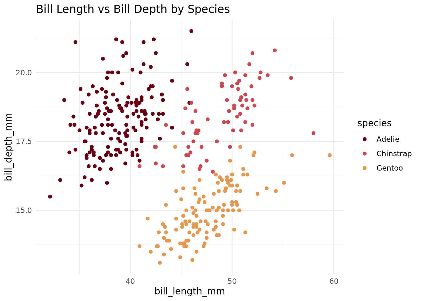
This is fine, but we might want to get rid of the legend and explicitly denote species/color mappings in the plot title. We can do that as follows.
ggplot(penguins, aes(x = bill_length_mm, y = bill_depth_mm, color = species)) +
  geom_point() +
  labs(
    title = glue("Bill Length vs Bill Depth for <span style='color:{pal[1]}'>Adelie</span>, <span style='color:{pal[2]}'>Chinstrap</span>, and <span style='color:{pal[3]}'>Gentoo</span> Penguins")
  ) +
  scale_color_hp(discrete = TRUE, option = "HermioneGranger") +
  theme(
    legend.position = "none",
    plot.title = element_markdown()
  )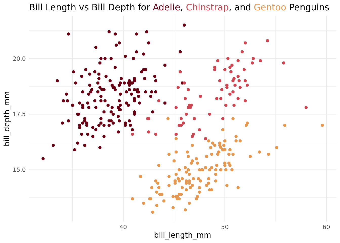
The key to the above is the <span> tags in the title as well as the plot.title = element_markdown() argument in the theme. All in all, this requires a little bit more setup, but I think the plot looks cleaner/more refined.